Guide
Bar charts
A bar chart is the frequency column of your table drawn as bars. Observations along the bottom, frequency up the side, and the tallest bar is the mode.
When we present our data, we often do it with diagrams. A bar chart can show many different things depending on what we put on the x-axis and the y-axis, but the classic bar chart has our observations on the x-axis and the frequency on the y-axis. The usual slip is mixing up the two axes, or forgetting that the bar heights come straight from a table you've already made.
When do I use this?
When you want to show, at a glance, how often each observation occurs. It's the first picture we draw in statistics, and it comes directly from the frequency table. We'll keep using the shoe sizes of a class of 20:
The procedure
1. Get the frequencies
From the frequency table, size 38 occurs 4 times, size 39 occurs 5 times, 40 and 41 occur 3 times each, 42 occurs twice, and 43, 45 and 46 occur once each.
2. Put the observations on the x-axis
Write the shoe sizes along the bottom: 38, 39, 40, 41, 42, 43, 45, 46. There's no 44 in the class, so there's no bar for it.
3. Put the frequency on the y-axis
The y-axis counts. The largest frequency is 5, so the axis needs to go up to at least 5.
4. Draw a bar for each observation
Each bar is as tall as the frequency of that observation:
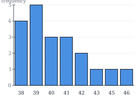
Here we can see the frequencies for the different observations. The bar over 39 is the tallest, because 39 occurs the most.
Bar chart or vertical line chart?
You'll meet two names for this picture. A vertical line chart is really the same as a bar chart, except that it uses thin lines instead of thick bars. Same axes, same heights, same information. Don't let the two names make you think they are two different tools.
Worked examples: reading a bar chart
- Which shoe size is the most common? The tallest bar: 39, with frequency 5. That is the mode, which you can read more about in mean, median, mode and range.
- How many pupils have size 42? The bar over 42 reaches 2.
- How many pupils have size 40 or 41? Add the two bars: .
- How many pupils are there in total? Add every bar: , which matches the size of the class.
Common mistakes
- "The axes can go either way round." The classic bar chart has the observations on the x-axis and the frequency on the y-axis. Swap them and the picture stops matching the table.
- "I should draw a bar for every number, including 44." Only the observations that actually occur get a bar. There is no 44 in this data set.
- "A vertical line chart is a different kind of diagram." It's the same chart with thin lines instead of thick bars.
- "I can read the mean off the bar chart." The chart shows frequencies. The mean has to be calculated from the data, as in mean, median, mode and range.
Related
The bar chart draws the frequency column of the frequency table. The other picture we draw from that table is the cumulative frequency graph. Everything sits under statistics: organising and describing data.
Frequently asked questions
Read next
Want to get good at maths?
Mathara explains every topic step by step with videos, exercises and personal feedback.
👉 Get started for free