Guide
Cumulative frequency graphs
A cumulative frequency graph shows how many per cent of the observations lie at or below each value. Find 50% on the y-axis, go across to the curve, drop down, and you've read the median.
A cumulative frequency graph shows the cumulative relative frequency of our observations. So we have the cumulative relative frequency on the y-axis and our observations on the x-axis. It's a good way to get an overview of how many per cent of the observations lie below or above a certain value. The hurdle is usually the first reading: you go in from the y-axis, not the x-axis.
When do I use this?
When you want to find the median, the quartiles, or any other percentage point of a data set by reading instead of counting. We can use the graph to read our quartiles, because on the y-axis we can find 25%, 50% and 75%, and from there see which observation the quartile lies at. It could be that our third quartile lies at 41, so we could say that 75% of the class have a shoe size that is less than or equal to 41.
The graph is built from the last column of the frequency table, so make that first. For the 20 shoe sizes the cumulative relative frequency is 20% at size 38, 45% at 39, 60% at 40, 75% at 41, 85% at 42, 90% at 43, 95% at 45 and 100% at 46.
The procedure for ungrouped data
If our data set is ungrouped, we draw the cumulative frequency graph with vertical and horizontal lines, like a staircase.
1. Draw the axes
Observations along the x-axis. Cumulative relative frequency up the y-axis, with 25%, 50%, 75% and 100% marked, because those are the points we read from most often.
2. Plot each cumulative percentage
At shoe size 38 the graph jumps up to 20%. It stays there until 39, where it jumps to 45%. At 40 it jumps to 60%, and so on until it reaches 100% at 46.
3. Join them as steps
Each single observation value makes the graph jump by a whole amount, so we join the points with vertical and horizontal lines:
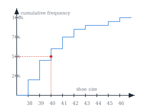
The graph shows how the cumulative relative frequency develops. That way we can go in and read how many per cent of the observations lie within a certain percentage. It doesn't have to be 25%, 50% and 75%. It could just as well be 10%, if we wanted.
4. Read a value off the graph
Pick the percentage on the y-axis, go across to the curve, and drop straight down to the x-axis. In the figure, all the observations that lie below the point where the red line drops are in the bottom 50%. It lands on shoe size 40, which means that 50% of our class have a shoe size of 40 or under. That is the median, and it agrees with the median we find by sorting in mean, median, mode and range.
In the exam you'll often see the y-axis showing the cumulative frequency itself, so 4, 9, 12, 15 and so on instead of 20%, 45%, 60%, 75%. It's the same column of the table and the same shape of graph, only the scale on the side changes: 10 out of 20 is 50%.
The procedure for grouped data
When we make a cumulative frequency graph for a grouped data set, so when we have intervals instead of single values, the graph looks different. The difference is just that we don't use vertical and horizontal lines. We join the points with straight lines instead.
When we have an interval, for example heights in a class, there are two different values in the interval:
We use the value we call the right endpoint, which is the largest value in the interval, so the one on the right, here 170. All the observations we put on the x-axis when we draw a cumulative frequency graph for grouped data are right endpoints. So for each interval you plot the cumulative percentage at the largest value of that interval, and then you join the points with straight lines.
Worked examples
- Third quartile of the shoe sizes. Find 75% on the y-axis, go across, drop down: you land on 41. So 75% of the class have a shoe size of 41 or less.
- First quartile. Find 25%, go across. The graph is at 20% at 38 and jumps to 45% at 39, so the 25% line meets the graph at 39. The first quartile is 39.
- A 10% reading. The 10% line meets the first step, at 38. So 10% of the class have size 38 or less. This is the same move as the quartiles, just with a different percentage.
Those three readings, together with the minimum and maximum, are exactly what you need for a box plot.
Common mistakes
- "I start from the x-axis." You start from the percentage on the y-axis, go across to the curve, then drop down to read the observation.
- "The y-axis is the frequency." It's the cumulative frequency, so it only ever goes up, and it ends at 100% (or at the total number of observations).
- "Ungrouped and grouped graphs are drawn the same way." Ungrouped data gives steps. Grouped data gives straight lines between points plotted at the right endpoint of each interval.
- "For an interval I plot the left endpoint, or the middle." We use the right endpoint, the largest value in the interval.
Related
The graph is the last column of the frequency table drawn as a curve, and what you read off it feeds straight into quartiles, interquartile range and box plots. The percentages on the y-axis are ordinary percentages of the total. Everything sits under statistics: organising and describing data.
Frequently asked questions
Read next
Want to get good at maths?
Mathara explains every topic step by step with videos, exercises and personal feedback.
👉 Get started for free