Maths dictionary
Statistics: organising and describing data
Statistics is about getting an overview of data. We collect observations, put them in a frequency table, draw them, and then describe them with a few numbers such as the mean, the median and the quartiles.
Sometimes you need to get an overview of some data, or some observations you've made. It could be that you want to look at how your observations are going to develop. We use descriptive statistics to describe, organise and make qualified guesses about what the future of our data might look like. It can be anything from what the weather looks like in a week to whether a share is going to rise or fall.
That is the whole idea. We have a pile of observations, and we want to describe, organise and get an overview of what the pile looks like.
Observations and data sets
Things we observe, that is the data we collect, we call observations. When we've collected all our observations, it could for example be the shoe sizes in a class of 20, we put them in a data set:
This is an example of a data set of shoe sizes in a class. As you can see, all the shoe sizes are there, because there are only 20 of them. This data set is going to follow us through every article about statistics, so you can see the same numbers under every lens.
Grouped and ungrouped data
Sometimes we put the observations into intervals, because that makes sense in certain situations. When the observations are not in intervals, like the shoe sizes above, we call it an ungrouped data set. A grouped data set could look like this, with intervals for heights in centimetres:
Notice which end of each interval has the "or equal to" sign. A number can't belong to two intervals at the same time, so a height of exactly 155 cm belongs to the first interval and not the second.
From a pile of numbers to a table
The first thing we do with a data set is to describe the frequency of our observations, that is, how often each observation occurs. For that we use a frequency table. It gives a good and easy overview of our data.
A frequency table has a row per observation and a handful of columns: the observation, its frequency (how many there are of it), the cumulative frequency (the frequencies added up as we go down), the relative frequency (how big a part of the whole that observation makes up, as a fraction, a decimal or a percentage) and the cumulative relative frequency. For the shoe sizes, size 39 occurs 5 times, which is of the class. The full table, column by column, is in the guide how to make a frequency table.
From a table to a picture
When we present our data, we often do it with diagrams. The classic bar chart has our observations on the x-axis and the frequency on the y-axis:
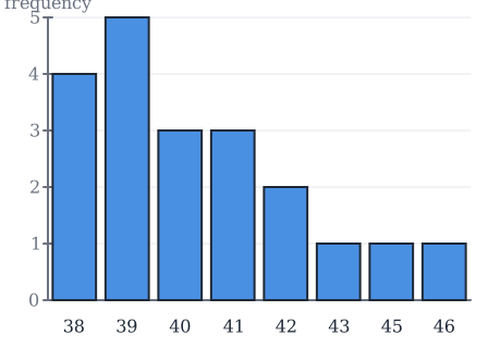
Here we can see the frequencies for the different observations straight away. Size 39 is the tallest bar, because it occurs the most. The guide on bar charts goes through it.
The other picture we draw is the cumulative frequency graph. It shows the cumulative relative frequency on the y-axis and the observations on the x-axis, and it's a good way to get an overview of how many per cent of the observations lie below or above a certain value. That one gets its own guide about cumulative frequency graphs.
Descriptors: describing the data with a few numbers
In statistics we want to describe what our data looks like. So we use different descriptors, which each tell us something about our data. It could be a mean, which shows the middle value of some data. Every descriptor tells us something different about the data set, and that is useful when we investigate our data. Some descriptors describe both grouped and ungrouped data, where others only describe one of them.
Here is an overview of the descriptors we work with, all applied to the shoe sizes:
- The mean, the sum of all the observations divided by how many observations there are. For the shoe sizes that is .
- The minimum and maximum value, the smallest and the largest observation. Here and .
- The range, the difference between the largest and smallest observation: .
- The mode, the number that occurs the most times. Here , because it occurs 5 times.
- The median, the number in the middle when the observations are sorted from smallest to largest. Here .
- The quartiles , and , the numbers that 25%, 50% and 75% of the observations lie below. is the median.
The first five are worked through in mean, median, mode and range. The quartiles get their own guide, together with the box plot.
The box plot
Once we have the minimum and maximum values and the three quartiles, we can draw a box plot. It's an easy way to get an overview of the quartiles: with a box we can clearly see where the first, second and third quartile lie, and the minimum and maximum value of the data set.
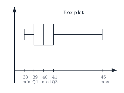
How to find the five values and draw the box is in quartiles, interquartile range and box plots. The width of the box, from to , is also what we use to decide whether an observation is an outlier.
How the pieces fit together
It helps to see the order things come in, because each step reads off the one before it:
- Collect the observations into a data set.
- Count them into a frequency table.
- Draw the table as a bar chart, or the cumulative column as a cumulative frequency graph.
- Read off the descriptors: mean, min and max, range, mode, median, quartiles.
- Summarise the quartiles in a box plot.
Nothing new is invented along the way. The bar chart is the frequency column drawn as bars, the cumulative frequency graph is the last column drawn as a curve, and the quartiles can be read straight off that curve.
Common misunderstandings
- "The intervals in grouped data can overlap." No. A number can't belong to two intervals at the same time, so exactly one end of each interval includes its endpoint. Notice which end that is.
- "The same descriptor works on any data set." Not quite. Some descriptors describe both grouped and ungrouped data, where others only describe one of them.
- "A bar chart and a vertical line chart are two different tools." They're really the same picture. One draws thick bars, the other thin lines, and both have the observations on the x-axis and the frequency on the y-axis.
- "The y-axis of a cumulative frequency graph counts observations." In the way we draw it, the y-axis is in per cent, from 0% to 100%, so you can read off where 25%, 50% and 75% of the observations lie.
Related guides
- How to make a frequency table
- Bar charts
- Mean, median, mode and range
- Cumulative frequency graphs
- Quartiles, interquartile range and box plots
- Outliers: the 1.5 times IQR rule
The relative frequencies in a frequency table are just fractions written as percentages, so those two are worth having fresh in your mind.
Guides on this topic
Bar charts
A bar chart is the frequency column of your table drawn as bars. Observations along the bottom, frequency up the side, and the tallest bar is the mode.
Cumulative frequency graphs
A cumulative frequency graph shows how many per cent of the observations lie at or below each value. Find 50% on the y-axis, go across to the curve, drop down, and you've read the median.
How to make a frequency table
A frequency table turns a pile of observations into a few columns you can read everything off. We build one for 20 shoe sizes, one column at a time.
Mean, median, mode and range
The mean, the median, the mode and the range each describe a data set in one number. We find all four for 20 shoe sizes and see what each one tells us.
Outliers: the 1.5 times IQR rule
An outlier is an observation that lies much further away than the rest. 'Much further away' is vague, so we make it precise with the interquartile range: anything beyond 1.5 times the IQR from the box is an outlier.
Quartiles, interquartile range and box plots
The quartiles split a sorted data set at 25%, 50% and 75%. Put them together with the smallest and largest value and you can draw a box plot, the quickest overview of a data set there is.
Frequently asked questions
Read next
Want to get good at maths?
Mathara explains every topic step by step with videos, exercises and personal feedback.
👉 Get started for free