Guide
Quartiles, interquartile range and box plots
The quartiles split a sorted data set at 25%, 50% and 75%. Put them together with the smallest and largest value and you can draw a box plot, the quickest overview of a data set there is.
We have three quartiles in statistics, and together with the smallest and largest observation they give a five-number summary of a data set that you can draw as a box plot. The hurdle is remembering what each quartile means: not "a quarter of the values", but "the number that a quarter of the values lie below".
When do I use this?
When the median alone doesn't say enough, and you want to know how the data is spread around it. The quartiles are the next descriptors after mean, median, mode and range in statistics, and the box plot is the quickest way to draw them.
We keep using the shoe sizes of a class of 20:
The three quartiles
The first quartile, written , marks the part of the observations that is smallest. The first quartile is the number that 25% of the observations lie below.
The second quartile, , is the median. The median shows that 50% of the observations lie above it and 50% lie below.
The third quartile, , is the number that 75% of the observations lie below.
- 1st quartile: 25% of the observations lie below this number.
- 2nd quartile (the median): 50% of the observations lie below this number.
- 3rd quartile: 75% of the observations lie below this number.
Other percentages: fractiles
A quartile is really just a special case. When we look at a fractile, we look at a part of the data set. Say we look at the 10% fractile: then we look at the bottom 10% of our data set, a bit like looking at the bottom 25% for the first quartile. The 10% fractile is the largest number in that bottom 10%. In the exam you'll usually only meet the three quartiles, but the idea is the same for any percentage.
The procedure: finding the quartiles
The easiest way is to read them off the cumulative frequency graph: find 25%, 50% and 75% on the y-axis, go across to the curve, and drop down. For the shoe sizes the cumulative relative frequency is 20% at size 38, 45% at 39, 60% at 40 and 75% at 41.
- : the 25% line meets the graph at 39, because at 38 we've only reached 20%. So .
- : the 50% line meets the graph at 40. So the median is , the same as we get by sorting and crossing out from both ends.
- : the 75% line meets the graph exactly at 41. So , and 75% of the class have a shoe size that is less than or equal to 41.
Together with the minimum value 38 and the maximum value 46, we now have all five numbers.
The interquartile range
The interquartile range is really just the difference between the third quartile and the first quartile:
For the shoe sizes that is . It tells you how wide the middle half of the data is, and it's the number we use when we decide whether an observation counts as an outlier.
The box plot
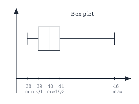
A box plot is an easy way to get an overview of the quartiles. With a box we can clearly see where the first, second and third quartile lie, and the minimum and maximum value of the data set.
To draw a box plot we need:
- the minimum and maximum values of the data set,
- the quartiles (, the median and ).
Draw a number line for the observations. Draw a box from to , and a line inside the box at the median. Then draw a line, a whisker, from the box out to the minimum on the left and out to the maximum on the right. The width of the box is the interquartile range.
With these values in one picture we have an overview of our data and what it actually tells us: half the class sits inside the narrow box between 39 and 41, and the long whisker to the right shows that a few pupils have much bigger feet than the rest.
Worked example: reading a box plot
Suppose a box plot for another class has its whiskers at 36 and 44, its box from 38 to 42, and the line inside the box at 39.
- Minimum 36, maximum 44, so the range is .
- , median , .
- Interquartile range , twice as wide as the shoe-size class above, so the middle half of this class is more spread out.
Common mistakes
- "Q1 is a quarter of the observations." is a value on the number line: the number that 25% of the observations lie below.
- "The median and the second quartile are different things." They're the same number.
- "The box goes from the minimum to the maximum." The box goes from to . The whiskers go out to the minimum and the maximum.
- "The interquartile range is the length of the whole plot." That's the range. The interquartile range is only the width of the box, .
Related
The quartiles are read off the cumulative frequency graph, the median is the same one you find in mean, median, mode and range, and the interquartile range is the key to outliers. All of it lives under statistics: organising and describing data.
Frequently asked questions
Read next
Want to get good at maths?
Mathara explains every topic step by step with videos, exercises and personal feedback.
👉 Get started for free