Guide
Scatter graphs and the line of best fit (linear regression)
A line of best fit is the straight line that describes a scatter of points as well as possible. Here is what it is for, how to judge how well it fits, and when a straight line is the wrong choice.
Linear regression is a way of making the equation of a function out of some given points. At GCSE the line it produces is called a line of best fit. We usually get a program to make the equation, since it's a bit of a hassle to do by hand. For GCSE you draw the line by eye, and the hard part is not the drawing but knowing how to judge whether the line actually fits.
When do I use this?
When you have a lot of points from measurements, plotted in a coordinate system (a scatter graph), and you want one straight line that describes them as well as possible. The line is a linear function like any other, with a gradient and a y-intercept . Regression is not a separate kind of maths: it just finds the and of the line that fits the points best.
From points to a line
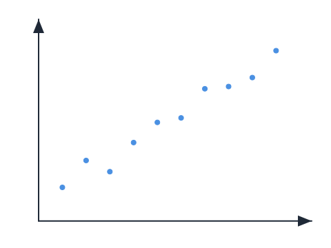
Say we were given these points, and they show some relationship or other. It could be the average wage in the country over the years, or how many kilos you can bench press against your age. We now want to find a straight line that describes these points as well as possible. That is where we use linear regression: to find the straight line that fits these points best. That way we can make a qualified guess at how the future will look.
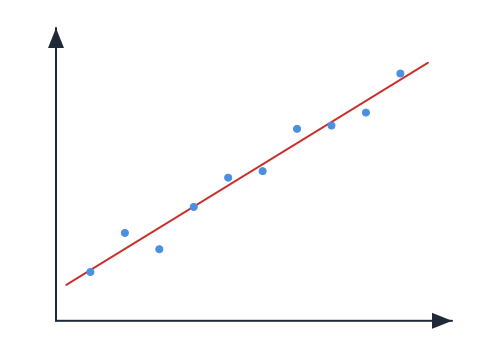
That could be what the straight line looks like. A CAS tool or a graphing calculator gives us the line with an and a that describe the points as well as possible. For GCSE you draw the line yourself, straight through the middle of the points, the way the picture shows. Either way, once you have the line you can read off the -value for an you never measured. That is the qualified guess.
How well does the line fit? The deviations
But how do we know how well the line actually describes the points? What if there wasn't really a straight-line relationship between the points at all? To judge how well our line fits the points, we look at the difference between the points and the line.
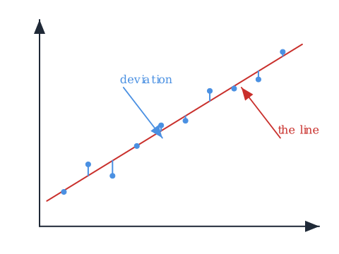
Each of these vertical distances is a point's deviation from the line. The smaller these distances from point to line are, the better, of course, because then we have a line that lies very close to the actual points.
The residual plot
When we plot these deviations on their own, we look at whether the points lie "randomly". By that we mean that the points don't clump together or form a curve, like a parabola. If they did, our regression wouldn't fit well.
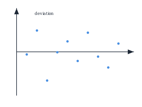
This residual plot looks fine, because it looks random and no clear pattern is formed.
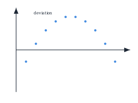
Here it is not good. The deviations form a clear arch, so the points don't really follow a straight line, and a line of best fit is the wrong tool.
There are many types of regression, so it may well be that you shouldn't use linear regression in a given situation. Maybe the situation doesn't grow linearly at all, but exponentially, or as another type of function.
Common mistakes
- "The program knows the right line, so it must fit." The program finds the straight line that fits best, but that does not mean a straight line fits well. You still have to look at the deviations and judge.
- "The points look roughly like a line, so a line of best fit is fine." Check the deviations first. If they form a pattern, an arch for example, the points follow a curve, not a line, however straight they looked at first.
- "Linear regression is always the right choice." It isn't. There are many types of regression, and the residual plot is what tells you the straight line was the wrong choice.
Related
- Back to the pillar: linear functions and straight-line graphs.
- What the and of your line mean: gradient and y-intercept.
- Organising the data before you plot it: statistics.
Frequently asked questions
Read next
Want to get good at maths?
Mathara explains every topic step by step with videos, exercises and personal feedback.
👉 Get started for free