Guide
How to plot the graph of an equation
Every x-value we put into a function gives us a point. Plot a handful of them, draw the line through them, and you have the graph. Here is the method with y = 2x and a real-life example.
To plot the graph of an equation we put a few x-values into it, work out the y-values, plot the points and draw the line through them. The step people miss is the very first one: seeing that an x-value and its y-value together are simply a point.
When do I use this?
Whenever an exam question says "draw the graph of" or "complete the table and plot". It works for any function, and it's the way we turn a rule like into a picture. You need to be comfortable plotting a point first, which is covered in the guide on coordinates.
A value in a function is a point
There is actually a close connection between functions, the coordinate system and points. Let's look at the function from before,
When we put an x-value into the function, we actually get a point. When we put 3 into the function, the y-value turns out to be 6, since we have to say . So
which, after all, is just like the coordinates of a point:
So when we work out particular values in functions, we can visualise them with points in a coordinate system.
The procedure
Step 1: choose some x-values
Let's try putting several x-values into our function . We'll take the x-values 1, 2, 3, 4 and 5.
Step 2: work out the y-values
Here we've really just put the different x-values we chose into the function and worked out the y-value for each of them. In an exam this is the "complete the table" part: one column for , one for .
Step 3: write them as points and plot them
So we get five points:
When we put all these points into a coordinate system, it looks like this:
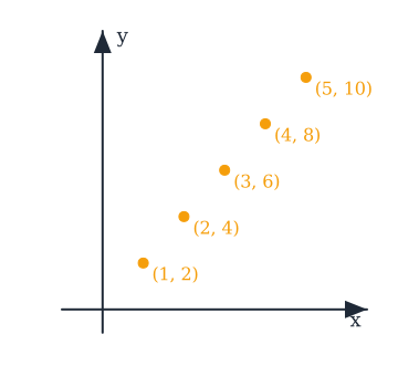
Step 4: draw the line through them
As we can see, the function makes a pattern. It's as if, no matter which x-value we put into the function, the point always ends up lying on one line.
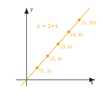
That line is actually what we call the function's graph. If we pretend that we plotted points for infinitely many x-values, we'd get exactly this line. So when we visualise a function, we do it with a graph. All functions have a graph, which we can use to see how the connection develops.
Worked example: a real-life graph
Let's look at an example with prices. Let's say a cinema ticket costs £10. Then we can set up a function that looks like this:
or written with and :
When we want to work out the price of the tickets, we multiply the price of one ticket (£10) by how many tickets we want. If we wanted 3 tickets, it would look like this:
So 3 tickets would cost £30. The graph of this function looks like this:
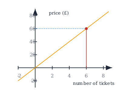
When we look at the graph, we can see that we have the number of tickets on the x-axis and the price on the y-axis. That's because the price depends on how many tickets we buy, so the price is the dependent variable, and that's why it goes on the y-axis. The number of tickets doesn't depend on anything, so it's the independent variable and goes on the x-axis. Remember that we always want the dependent variable on the y-axis and the independent variable on the x-axis.
With this graph we now have a quick and easy overview of how the price develops. We can go straight in and read off how much we have to pay if we buy, say, 4, 5 or 7 tickets. If we wanted to buy 6 tickets, for example, we can read off that it'll cost £60: go to 6 on the x-axis, up to the line (the red line in the picture), and across to the y-axis. So graphs are a really good tool for visualising functions.
Common mistakes
- "I plotted the points but the line doesn't go through them." Then one of the y-values is wrong. Every point comes straight from the function, so go back to the table and redo the calculation for the point that sits off the line.
- "I put the y-value first." The x-value we chose is the first number in the bracket and the y-value we worked out is the second: , not .
- "I put the price on the x-axis." The dependent variable, the one that comes out of the function, always goes on the y-axis. The one we choose goes on the x-axis.
Related
Frequently asked questions
Read next
Want to get good at maths?
Mathara explains every topic step by step with videos, exercises and personal feedback.
👉 Get started for free